Releases: sparkdesignsystem/spark-design-system
Hotfix - September 7th, 2021
Patches the typography family setting from being a specific font weight like "RocketSansLight" to being "RocketSans". This change affects all packages.
@sparkdesignsystem/spark-react@7.0.2
@sparkdesignsystem/spark@18.0.2
@sparkdesignsystem/spark-angular@15.0.2
@sparkdesignsystem/spark-styles@4.0.2
Publish - August 30th, 2021
Summary
We've removed utility classes from being used in the components. We had some typography updates, and flipped the accordion arrow icon. The angular code dependency has been updated to support 11. We updated the angular storybook and it now uses inline rendering which makes the Docs page load much faster.
❗️ This release is medium-large. Depending on the app.
Allocate Dev and Design time accordingly and refer to the Upgrade Guide at the bottom of these release notes for project scope. The largest efforts are checking your entire app for any visual changes upon upgrading.
Package Versions
- Angular: 14.0.0 -> 15.0.0
- React: 6.0.0 -> 7.0.0
- Spark (HTML): 17.0.0 -> 18.0.0
- Styles: 3.0.0 -> 4.0.0
All packages
- 🚨 Removes the use of utility classes from Spark, this touches all three frameworks and is a breaking change because we removed the use of
!importantfrom components and added some new classes. - 📌 This release includes minor adjustments to typography settings throughout Spark. Text in every component will have been slightly modified in terms of line height, font size, and/or font weight. Be sure to review your application thoroughly to make sure all text content is still usable.
- Flip accordion arrow icon & add additional class for optional top border #4039

- Input labels, spacing and copy in Storybook are now consistent with each other.
- There is a space for App Store Badges in the Footer:

- Typography updates, and a new documentation page.
- Select component's icon position is set to
relativeso it's visible if there's an autofill present.
Angular
- Upgrade Angular Storybook to latest version. Check it out!
- Removes the use of utility classes from Spark, this touches all three frameworks and is a breaking change because we removed the use of
!importantfrom components and added some new classes. - Add App Store links in the footer with the new
app-slot isElementVisiblefunction is now checking ifwindowisundefined. This makes sure that errors don't show up. Affects Autocomplete, and Masthead components.- For those needing a more custom Footer Award section, use the new
additional-award-slot - Typography updates, and a new documentation page.
- Updates peer dependencies to be up to Angular 11.2.14.
- Select component's icon position is set to
relative.
React
- Removes the use of utility classes from Spark, this touches all three frameworks and is a breaking change because we removed the use of
!importantfrom components and added some new classes. - A new prop to
SprkStackcalledisStackItem. Set totruewill add the stack item class in cases where you need your Stack to also be an Stack Item. - New
app-slotprop is available to pass in into Footer. - 📌 Helper text elements are not
<p>tags instead of<div>tags for better semantics. - Typography updates, and a new documentation page.
HTML
- Removes the use of utility classes from Spark, this touches all three frameworks and is a breaking change because we removed the use of
!importantfrom components and added some new classes. isElementVisiblefunction is now checking ifwindowisundefined. This makes sure that errors don't show up. Affects Autocomplete, and Masthead
Styles
- Added new modifier to Stack of
/// Centers children of the Stack.
.sprk-o-Stack--center-all {
  align-items: center;
  justify-content: center;
}
- Added new type helpers
// Type Helpers
.sprk-b-Type--center {
  text-align: $sprk-type-center;
}

.sprk-b-Type--left {
  text-align: $sprk-type-left;
}

.sprk-b-Type--right {
  text-align: $sprk-type-right;
}
Upgrade Guide
HTML
- Typography updates may shift some elements in your app. Do a visual check and adjust accordingly.
- Find Dropdown instances by searching the project for
sprk-c-Dropdown. If there issprk-u-Display--noneutility class, remove and replace withsprk-c-Dropdown--is-hidden. - Find Modal instances by searching the project for
sprk-c-Modal. If there issprk-u-Display--noneutility class, remove and replace withsprk-c-Modal--is-hidden. You may also need to look forsprk-c-ModalMaskand replacesprk-u-Display--nonewithsprk-c-ModalMask--is-hidden. - Update the Masthead code to match our copy code. 🚨 We removed a handful of utility classes like
sprk-u-Display--nonethat used!importantand replaced them. See all of the main difference in the Pull Request.

Angular
- Typography updates may shift some elements in your app. Do a visual check and adjust accordingly.
- Improve your code semantics by searching for
sprkHelperTextdirectives and turning it into a<p>if appropriate. - 🚨 We removed many utility classes from components and stories. These classes had
!importanton them and overid styles. Do a visual check on your app to make sure that unintended styles aren't applying because of this removal. Explore our PR and take a look at the stories.
React
- Typography updates may shift some elements in your app. Do a visual check and adjust accordingly.
- 🚨 We removed many utility classes from components and stories. These classes had
!importanton them and overid styles. Do a visual check on your app to make sure that unintended styles aren't applying because of this removal. Explore our PR and take a look at the stories. - If you have custom styling by selecting css via the
.sprk-b-HelperTextclass, also make sure you're not selecting via a<div>element. It's a<p>tag now.
Publish - August 12th, 2021 - Patch to Spark Angular
- The
isElementVisiblefunction is now checking ifwindowisundefined. This makes sure that errors don't show up in the edge-cases of a windowless environment. Affects Autocomplete, and Masthead currently. - Added Rocket Auto logo to the footer across frameworks in the example code.
New Version
@sparkdesignsystem/spark-angular@14.0.1
July 20th, 2021 - Spark HTML Spinner Patch
Summary
This release adds a patch update the the Spark HTML package.
New version: @sparkdesignsystem/spark@17.0.1
HTML
- Add
data-sprk-spinner="is-not-disabled"for Spark Spinner. This is identical to
data-sprk-spinner="click"except the button will not be disabled when it
is clicked. This should be used for buttons that submit a form.
Spring 2021 🌸 🌷
Summary
This release continues our journey towards even more flexible components for developers. Angular Masthead and React Inputs are now compositional, and Autocomplete is now available for Angular packages. There are also various bug and accessibility fixes.
❗️ This is a very large, breaking release.
Allocate Dev and Design time accordingly and refer to the Upgrade Guide at the bottom of these release notes for project scope. The largest effort updates are Angular Masthead and React inputs.
Package Versions
- Angular: 13.0.0 -> 14.0.0
- React: 5.0.0 -> 6.0.0
- Spark (HTML): 16.0.0 -> 17.0.0
- Styles: 2.0.0 -> 3.0.0
Documentation
Spark Styles
Masthead
- Reduced size of content padding.
- Added use of wide variable to the Type Display One styles (
$sprk-font-size-display-one-wide).
HTML
Inputs
- Modified Input stories to provide better support for screen readers and other assistive technology.
Footer
- Footer text that need an inline link can use
sprk-b-Link--inline-lightfor the appropriate styling on dark background. This is reserved for footer for now.
Angular
Autocomplete
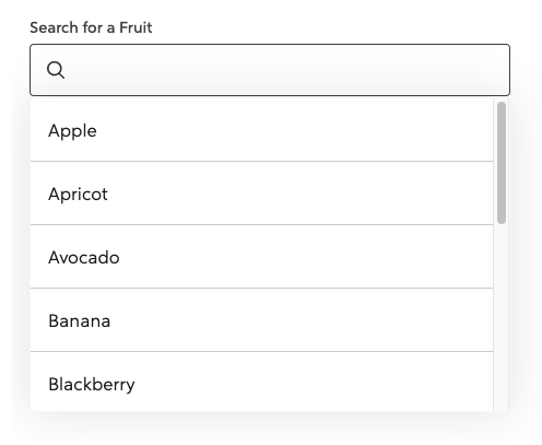
The Spark Autocomplete component is now available in spark-angular. This component can be used to help users filter and select from a list of options. For examples on how to configure and use Autocomplete, refer to our kitchen-sink repo (search for "autocomplete" to find the examples).
Masthead
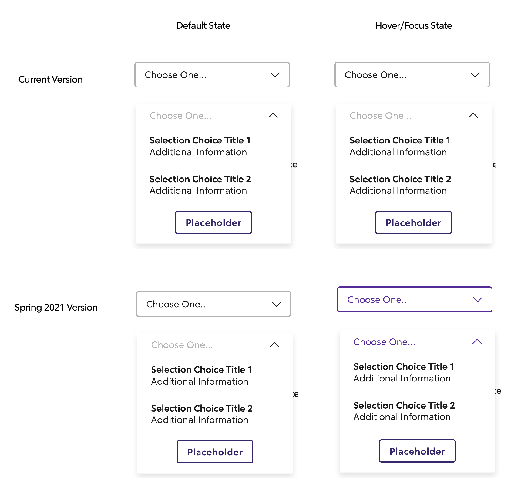
- Updated the Masthead to be compositional. ❗️ This is a breaking change.
- Added the ability to have a Masthead without a collapsible nav on small screens.
- Added two new stories for Masthead that show it without the collapsible nav and show it with an example page so the scrolling functionality is viewable.
- Updated the Masthead Accordion to use
headinginstead oftitlefor the prop name since title causes an a11y error. - Added ability to pass in an
aria-labelto the Masthead Accordion. - Improved a11y of Masthead collapsible navigation button by adding
focusable="false"to the SVG Icon. - Added output event to the collapsible navigation button.
- Fixed an issue in Angular 11 where our use of HostBinding in directives needed a property name. Thank you @jtneal for your contribution! #3979
Inputs
- Modified Input stories to provide better support for screen readers and other assistive technology.
sprk-icon
- Added a new
ariaHiddenInput. The value of thisInputwill be applied to thearia-hiddenattribute on thesvgelement. - Added a new slot to the footer for
additional-disclaimer-slotthat allows for content projection.
Stack
- Added a new input for
isStackItemthat will apply the stack item class if set totrue. - Added a new
splitAtvalue ofextraTinyto match thesplit@xxsbreakpoint.
Tooltip
- Added
verticalAlignmentoptions.
React
- Updated the Inputs API and is now more compositional. This is a breaking change.
- Forwarded refs are now available
Tooltip
- Added
verticalAlignmentoptions.
🎒Upgrade Guide
ALL PACKAGES (Angular, React, HTML)
Angular Upgrade Guide
- Inputs
- Find any decorative
sprk-iconcomponents inside ofsprkFieldErrorand add aariaHidden="true". You'll typically found in invalid input states. - Remove
hasIcon="true"fromlabelelements on inputs - Phone: change from
type="text"totype="tel"
- Find any decorative
- Masthead: To give developers and apps flexibility, we converted this into a compositional component. Refer to the Masthead Storybook code to refactor your Masthead.
📍This is a large refactor and could take come time, allocate this effort into your sprint accordingly
React Upgrade Guide
Spark Inputs are now compositional to give developers more flexibility.
Legacy inputs are still available, but will be removed at the next major release.
Refer to the Storybook Inputs for updated code samples.
📍Because of amount of work this takes to refactor every input, we highly reccommend you start this refactor as soon as you can.
Note: Most Spark Inputs will require an id. Keep in mind if you see a "Failed prop type error".

HTML Upgrade Guide
- Give decorative icons the right attributes for screen readers and assistive technology
- Search for
sprk-c-Icon sprk-b-ErrorIconclass in your project, and addaria-hidden="true"andfocusable="false"to that element. - Find
sprk-b-InputContainer__iconclass in your project, and addaria-hidden="true"andfocusable="false"to that element. This is relevant for any icon that is decorative, and don't add information to the page.
- Search for
- Remove unnecessary utility class from Inputs
- Search for
sprk-b-TextInputand remove the classsprk-u-Width-100if it has it.sprk-b-TextInputnow has that 100% width utility class built in.
- Search for
- Date Picker changes
- Find Spark Date Picker by searching for
data-sprk-datepicker - Remove any use of the
sprk-b-Label--with-iconclass - Find the svg inside of the div with the class
sprk-b-TextInputIconContainerand addaria-hidden="true"andfocusable="false"attributes.
- Find Spark Date Picker by searching for
April 12th, 2021 - Breaking Changes for All Spark Packages
Summary
This release has breaking changes for all Spark packages. It includes component upgrades for angular inputs, dropdown, cards, promo and tabs. It also includes link color changes, input color changes and change of location of button call-to-actions inside the components. We removed the pink color and added a new orange.
❗️ This is a very large, breaking release.
Allocate Dev and Design time accordingly and refer to the Upgrade Guide at the bottom of these release notes for project scope.
Package Versions
- Angular: 12.1.1 - > 13.0.0
- React: 4.1.1 -> 5.0.0
- Spark (HTML): 15.1.1 -> 16.0.0
- Styles: 1.1.1 -> 2.0.0
Documentation
Spark Styles
- Removed
sprk-u-Width-100class from the inputs and built in that styling into sprk-b-TextInput. (width: 100%) - Consolidated pink and yellow error colors into orange.
- Pink and yellow are still available as tokens, but will be removed on the next breaking change release.
- Alerts, Inputs and Color Guides reflect this change. Legacy components will also use orange.
- See Color Usage Guide to learn where to use this error color.
- Orange utility classes are also available.
Button
- Updated Secondary and Tertiary buttons to use purples.
- Secondary will have the same silhouette, but purple
- Tertiary no longer has borders, but has styling on hover/focus.
- Removed Quaternary Button and is no longer in code base.

Default Link
- Default state is purple text, purple underline.
- Visited state is purple text, purple underline.
- Hover/Focus/Active state is red text, red underline.

Icon With Text Link
- Styles match Default Link but with no underline.
- Added the link transition to the icon so it animates the same as the text.

Informational Dropdown
- The text and the icon turn purple on hover (applies to both the open and closed state).

Footer Toggle (Toggle components found inside Footer components)
- The text and icon will be bold and underlined on hover, like Footer Links.

Masthead
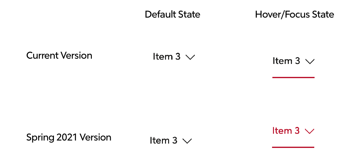
- The Masthead Selector text, border, and chevron icon will turn purple on hover when the selector is open and when it is closed.
- Extended navigation dropdown items will turn red on hover.
Inputs
- Updated colors for default, hover, focus, and error states on all inputs. Includes text inputs, selects, inputs with icons, autocompletes, radios, and checkboxes, including all huge variants.
- Refactors all input borders to be box-shadows.


Angular
Promo (Breaking Change❗️)
Updates the Promo component to accept ng-content and thus making it composition based instead of the current configuration based.
Card - (Breaking Change❗️)
Updates the Card component to accept ng-content and thus making it composition based instead of the current configuration based.
Button - (Breaking Change❗️)
- Quaternary Button is no longer available. Replace all Quaternary Buttons with Secondary or Tertiary Button.
Dropdown (Breaking Change❗️)
additionalIconClassesis deprecated and replaced withiconAdditionalClasses.additionalTriggerClassesis deprecated and replaced withtriggerAdditionalClasses.additionalTriggerTextClassesis deprecated and replaced withtriggerTextAdditionalClasses.titleis deprecated and replaced withheading.dropdownTypeis deprecated and replaced withvariant- variant
baseis replaced withdefault. mastheadSelectorvariant is deprecated and replaced with an internal selector component (sprk-masthead-selector)
- variant
Highlight Board
- Improved documentation.
Masthead
- Extended Navigation: Updated Masthead Selector to have its own CSS Namespace. Padding and color contrast improvements. Note: Former Dropdown Selector namespaces will still work.
Tabs
- The
sprk-tabbed-navigationcomponent is deprecated and replaced withsprk-tabsin an upcoming release. sprk-tabbed-navigation-panelis deprecated and replaced withsprk-tabs-panel.sprk-tabbed-navigation-tabis deprecated and replaced withsprk-tabs-button.- The
defaultActiveInput onsprk-tabbed-navigation-panelandsprk-tabbed-navigation-tabis renamed toisDefaultActiveonsprk-tabs-panelandsprk-tabs-button. - New
Outputonsprk-tabs-button-tabClick.
Tooltip
- Updated how the width is calculated to address a bug on narrow screens where the tooltip was rendering out of the viewport and creating a horizontal scroll.
React
Button (Breaking Change❗️)
- Quaternary Button is no longer available. Replace all Quaternary Buttons with Secondary or Tertiary Button.
- New prop
forwardedRefhas been added to the component.
Card (Breaking Change❗️)
Updates the Card component to accept children and thus making it composition based instead of the current configuration based.
Dropdown
additionalIconClassesis deprecated and is replaced withiconAdditionalClasses.additionalTriggerClassesis deprecated and is replaced withtriggerAdditionalClasses.additionalTriggerTextClassesis deprecated and is replaced withtriggerTextAdditionalClasses.titleis deprecated and is replaced withheading.- Added new events
openedEventandclosedEvent. - Dropdown links can now be rendered as any element, including
react-router-domLinks.
Promo (Breaking Change❗️)
Updates the Promo component to accept children and thus making it composition based instead of the current configuration based.
Highlight Board
- Improved documentation.
- React Highlight Board will no longer throw a console warning if an image is used without
alttext.
Inputs
- Accessibility Bug fix: Spark Inputs will no longer assign an error container ID to
aria-describedbyif the input is valid. - New prop
ariaDescribedBy- any value(s) provided will be included inaria-describedbyon the input.
Masthead
- Extended Navigation: Updated Masthead Selector to have its own CSS Namespace. Padding and color contrast improvements. Note: Former Dropdown Selector namespaces will still work.
Tooltip
- Updated how the width is calculated to address a bug on narrow screens where the tooltip was rendering out of the viewport and creating a horizontal scroll.
HTML
Highlight Board
- Improved documentation.
Tooltip
- Updated how the width is calculated to address a bug on narrow screens where the tooltip was rendering out of the viewport and creating a horizontal scroll.
Masthead
- Extended Navigation: Updated Masthead Selector to have its own CSS Namespace. Padding and color contrast improvements. Note: Former Dropdown Selector namespaces will still work.
🎒Upgrade Guide
ALL PACKAGES (Angular, React, HTML)
Removed sprk-u-Width-100 from the inputs and added width: 100%; to sprk-b-TextInput
- Check inputs that have a
sprk-b-TextInputclass and remove unneededsprk-u-Width-100classes. Ensure layout doesn't change.
Changed Sass Variables
If you're overriding any of these variables, adjust to changes accordingly. See Design Token List for new defaults.
$sprk-btn-secondary-hover-border-color$sprk-btn-secondary-hover-background-color$sprk-btn-secondary-hover-text-color$sprk-btn-secondary-visited-text-color$sprk-btn-secondary-text-color$sprk-btn-secondary-border$sprk-btn-secondary-border-color$sprk-btn-secondary-background-color$sprk-btn-secondary-disabled-background-color$sprk-btn-tertiary-hover-shadow$sprk-btn-tertiary-hover-border-color$sprk-btn-tertiary-border-color$sprk-btn-tertiary-background-color$sprk-btn-tertiary-disabled-border-color$sprk-btn-tertiary-disabled-background-color$sprk-link-light-hover-font-weight$sprk-text-input-error-color$sprk-text-input-error-border-color$sprk-text-input-border$sprk-text-input-disabled-border-color$sprk-text-input-disabled-background-color$sprk-text-input-transition$sprk-input-huge-border-width$sprk-input-huge-box-shadow
Removed Sass Variables
If you're overriding any of these variables, adjust to changes accordingly. See Design Token List for new defaults.
$sprk-btn-quaternary-background-color$sprk-btn-quaternary-box-shadow$sprk-btn-quaternary-border$sprk-btn-quaternary-border-color$sprk-btn-quaternary-text-color- `$sprk-btn-quatern...
Publish Feb 24th, 2021 - Bug Fixes
Summary of Fixes
- Upgrades lodash in HTML and Angular packages
- Fixes a bug with Masthead where the content was being pushed down when a big navigation item was hovered
- Thank you to @jmrieger for their contribution to this release! @jmrieger identified and fixed a bug in the HTML Toggle component click handler that was causing the icon to be in the wrong direction with multiple keyboard/mouse clicks. Issue #3875
New Package Versions
@sparkdesignsystem/spark-react@4.1.1
@sparkdesignsystem/spark-angular@12.1.1
@sparkdesignsystem/spark@15.1.1
@sparkdesignsystem/spark-styles@1.1.1
Publish Feb 5th, 2021 - routerLink
Summary
Add ability to use routerLink in Spark Angular components, Award, Card, Masthead, Footer, Dropdown, Hightlightboard.
New Spark Angular Version
@sparkdesignsystem/spark-angular@12.1.0
Spark Docs 1.1.0
This release improves support for various types of screen reader navigation techniques on SparkDesignSystem.com.
Instructions on how to use these features in macOS VoiceOver
Improved Support for Landmark Navigation
- Reorder left side navigation so that all elements in the section are included in the
<nav>landmark element. - Change the upgrade banner from a
divto anaside.
Improved Support for Frame Navigation
- Added
titleto Youtube iframes. - Added
titleto all component preview iframes.
Improved Support for Header Navigation
- Changed section headers on Icons page to avoid duplicates
Improved Support for Link Navigation
- Redid the alt text of the images on the homepage. These had alt text that described the image but did not describe the link. When an image is the only content of a link, the text alternative for the image describes the unique function of the link.
Narrow Layout Improvements
- Added additional CSS styles to the code samples in the guides so that code samples render without requiring horizontal scrolling at a width of 320px
Color Contrast Improvements
- Switched code samples to a color theme with higher color contrast
January 4th, 2021
Summary
This release adds a new Autocomplete component to the Spark HTML package (not available for Angular or React yet) and adds the formatter and validator functions from HTML into the Spark React package as utilities. This release also adds a minified Spark CSS file to the Spark Styles package.
Package Versions
@sparkdesignsystem/spark-angularv12.0.2@sparkdesignsystem/spark-reactv4.1.0@sparkdesignsystem/sparkv15.1.0@sparkdesignsystem/spark-stylesv1.1.0
Documentation
- The Design Token Table is now more searchable than ever with a filter.
- Try searching for the keyword 'button' and you'll find all the relevant style tokens related to buttons!
Spark Styles
- Added a minified Spark CSS file that is available for import in your build systems if you must use CSS over Sass. Note that this CSS will use all of the default Spark style settings and will not use our Sass Variable / Theming system.
HTML
- adds a new Autocomplete component
Several new utilities functions have been added to Spark utilities. isDownPressed,isUpPressed,isLeftPressed, andisRightPressed- These utilities can be used in event handlers to determine if one of the arrow keys has been pressed.generateAriaOwns- This utility function will ensure that thetriggerandcontentelements are associated usingaria-owns.resetListItems- This utility function will loop through a collection and removeactiveClassand setaria-selected="false"on each item in the collection.
React
- Added Input Formatters and Validation to React Package