This the final Part of a 3-Part series. You can also check out Part 1 - Setting Up Your Environment and Part 2 - Installation.
Part 3: Adding Spark Components in an HTML Project
This guide will cover how to add components for HTML, CSS and JavaScript.
Our Starter Github Repositories are also available for reference:
- 'kitchen-sink' branch (Spark Installed with component examples.)
- 'without-spark' branch (all of the prerequisites before Spark Installation.)
For instructions on setting up Spark in other environments, check out the guides for Angular and React.
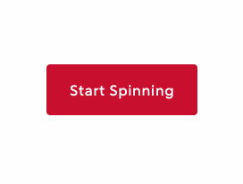
Adding Your First Spark Component
Adding a Spinner Button can confirm you've installed Spark's Styles and JavaScript correctly.
This is just one example to implement functionality and get your project started.
- Add Spark Button code into your
index.htmland include anonclickand adata-id.
<buttonclass="sprk-c-Button"data-id="button-spinner-1"onclick="startSpinner()">Start Spinning</button>
Note: Inside the
<body>tag ofindex.html, the line<script src="main.js"></script>should be after any other HTML elements.
- In the
index.jsfile, importsetSpinningfrom Spark and create astartSpinnerfunction (this is the function that will runonclick).
import { setSpinning } from '@sparkdesignsystem/spark';window.startSpinner = () => {const spinningButton = document.querySelector('[data-id="button-spinner-1"]');setSpinning(spinningButton, {});}
- Build your app with
npm run build, and you should find a Spark Button that loads a Spinner on click.
Learn more about Buttons and Spinner functionality in the Button Storybook documentation.
Finding the code to other Spark Components
- Go to the Spark HTML Storybook
- Find the Component you need in the "Components" section.
- Navigate to the Docs tab. It's typically at the top of screen next to Canvas.
- Navigate down the page until you find your component variant.
- The Show code button will toggle a code sample.
These code samples represent the rendered state after Spark's JavaScript functions run. Some functionality requires additional engineering.
The Docs section of each page will give implementation details for each component.
Additional Topics
- The Icon Installation Guide for importing the Spark SVG icon set.
- The Font Installation Guide for instructions on using the Rocket Sans font.