Installing Spark in a React Project
This guide walks you through installing and using Spark on an existing React app.
For help with setting up the necessary development environment, see the React App Getting Started Guide.
By the end of this guide, you’ll have Spark set up on your project and have access to all of our components.
Our starter app examples are available for reference:
- 'kitchen-sink' branch (Spark Installed with component examples.)
- 'without-spark' branch (All of the prerequisites before Spark Installation.)
Installing Sass
Sass is a tool that processes and compiles CSS. You’ll need to use Sass to import Spark styles into your site.- Run this command to install Sass:
npm install node-sass --save-dev
- Rename
App.csstoApp.scss - In
App.js, update the import line to point at the new filename.
import './App.scss'
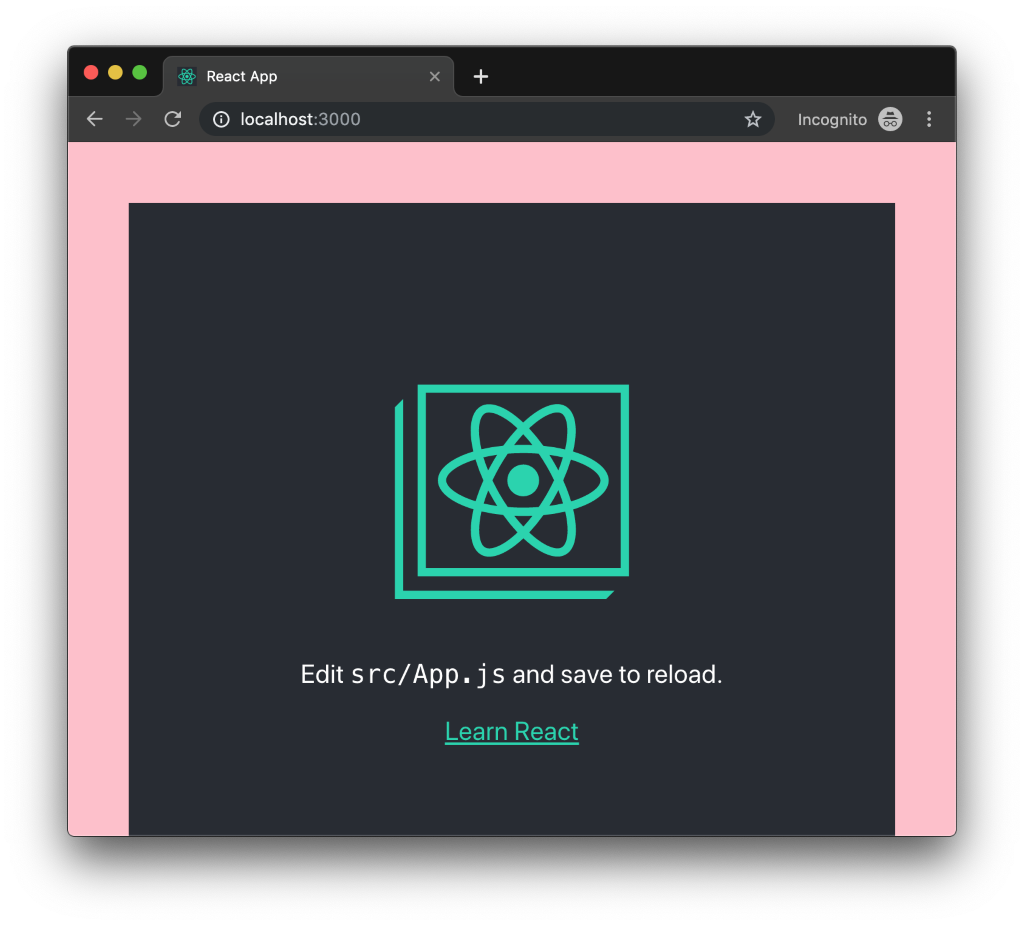
- Create a new file in
srccalledstyles.scssand copy this CSS into it:
body {border: 50px solid pink;}
- In
App.scss, import this new file:
@import './styles.scss';
If your React server has stopped, restart it now and view your compiled React site. You should see the new CSS you’ve written included in the site, along with the original React CSS:
Install Spark Packages
Now we’ll use Sass to import all the Spark CSS.
- Install the Spark React package. It contains all of the Spark React components and Sass styles needed to build with Spark.
npm install @sparkdesignsystem/spark-react --save-dev
- Import the Spark Sass file into the main Sass file (e.g.,
App.scss).
@import "../node_modules/@sparkdesignsystem/spark-styles/spark.scss";
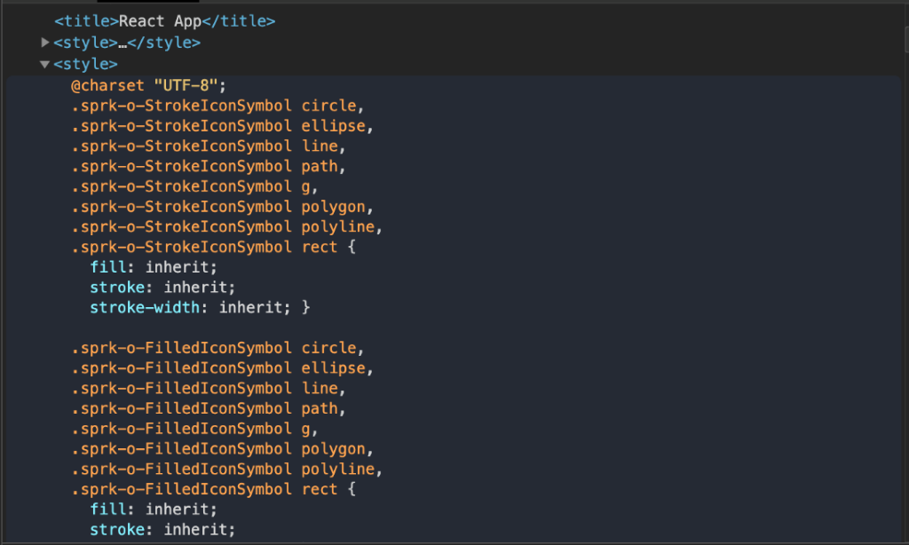
When you build and run your website, all the Spark CSS will now be bundled
into your output. You can verify this by inspecting your site’s DOM and
looking for the Spark CSS. There should be a <style> tag in the <head>
of your page that includes Spark’s styles.
Adding Your First Spark Component
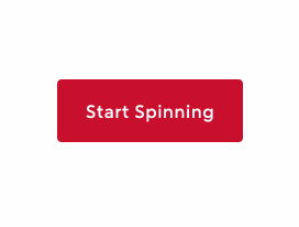
Adding a Spinner Button can confirm you've installed Spark React packages correctly.
This is just one example to implement functionality to get your project started.
Rewrite App.js to into a class component and prepare SprkButton to render a SprkSpinner on click.
import React from 'react';import './App.scss';import { SprkButton, SprkSpinner } from '@sparkdesignsystem/spark-react';class App extends React.Component {constructor(props) {super(props);this.state = {isAppLoading: false};}render() {return (<SprkButtonisSpinning={this.state.isAppLoading}onClick={() => { this.setState({ isAppLoading: true }) }}>{this.state.isAppLoading ? <SprkSpinner /> :'Start Spinning'}</SprkButton>);}}export default App;
This code sample has:
- An import of the React package.
- A reference to your
App.scssfile. - An import of
SprkButtonandSprkSpinner. - State that will handle the status of
isSpinning, and render theSprkSpinnerwhentrue(for this example, we'll name itisAppLoading). SprkButtonthat setsisAppLoadingtotrueafter clicking.- Logic inside of
SprkButtonthat renders theSprkSpinneraccording toisAppLoadingstate.
Now, you should find a Spark Button that loads a Spinner on click!
Learn more about
SprkButtonandSprkSpinnerfunctionality in the Button Storybook documentation.
Finding the code to other Spark Components
- Go to the Spark React Storybook.
- Find the Component you need in the "Components" section.
- Navigate to the Docs tab. It's typically at the top of screen next to Canvas.
- Navigate down the page until you find your component variant.
- The Show code button will toggle a code sample.
These code samples represent the final rendered state of the components. Just like with a
SprkButtonwith a spinner, some functionality requires additional engineering.
The Docs section of each page will give implementation details for each component.
Additional Topics
Check out these guides for more information on setting up Spark:
- The Icon Installation Guide for importing the Spark SVG Icon Set.
- The Font Installation Guide for instructions on using the Rocket Sans font.