Autocomplete
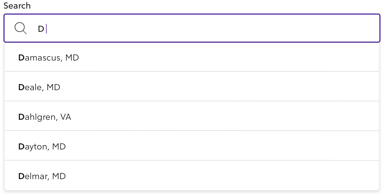
Autocomplete input fields allow the browser to predict information being entered by the user. The browser should display options based on previous information entered.
Developer Documentation
See the code and developer guidelines for this component.
Usage
Autocomplete helps users search for options that are difficult to remember or commonly misspelled. They allow designers to include more options to choose from, with less space.
Guidelines
Autocomplete input fields should be used:
- When information can be predicted from previously entered information.
- When accuracy and speed are important to the user.
- When the number of options is no longer convenient or efficient to display in a select box.
- When a select box has too many options but can be predicted for the user (i.e. states, countries).
Best practices for Autocomplete input fields:
- Try to keep lists under 10 matching options so the user doesn't have to scroll.
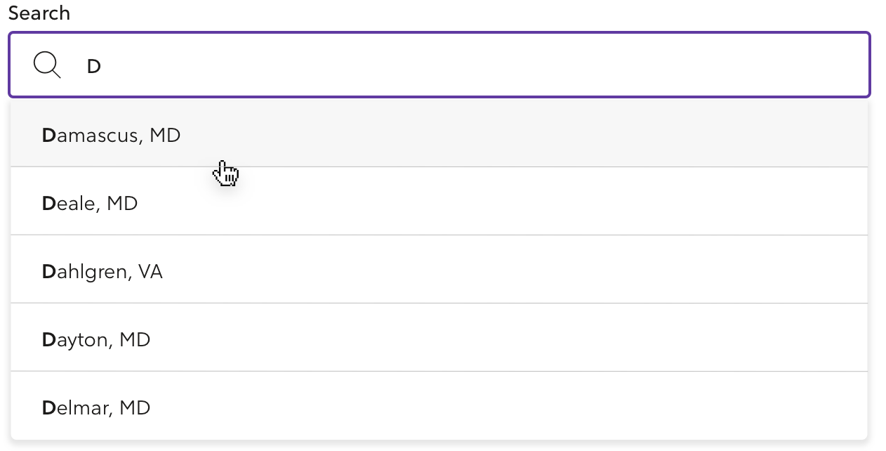
- Guide the user by highlighting the most relevant suggestion.
- Use text wrapping for longer suggestions.
- Order suggestions by relevancy for quick selection.
- Ensure the Autocomplete list is not blocking other elements on mobile.
Autocomplete is commonly used for search bars where accurate, quick suggestions help the user choose the correct data format for a task.
Variants
Default
Developer Documentation
See the code and developer guidelines for this component.
Huge
Huge Autocomplete is a larger version of the Autocomplete field.
They're commonly used as a standalone feature on the page.
Developer Documentation
See the code and developer guidelines for this component.
States
Each Autocomplete variant has an error and disabled state.
Error
Developer Documentation
See the code and developer guidelines for this component.
Disabled
Developer Documentation
See the code and developer guidelines for this component.
Active Typing
Selecting Option
No Results Found
Provide guidance and offer suggestions if no results are found or do not match any information in the database.
Create a better experience for the user by:
- Expressing empathy.
- Clearly communicate the state of the result.
- Offer suggestions for next steps.

Additional Customizations
No Search Icon
Showing a search icon is not required if an Autocomplete is part of a larger form.
Use the search icon when an Autocomplete is independent of other form elements on the page to provide clarity that this is a search field.
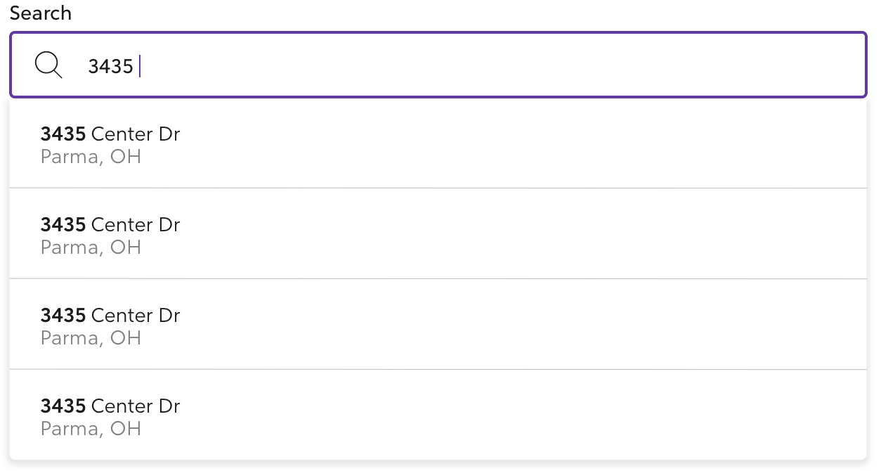
Address - Two Lines of Text
Addresses can span two lines when displaying the full address.
No Label
A label is not required for this input type. Autocomplete inputs should not use a label when used in a masthead.
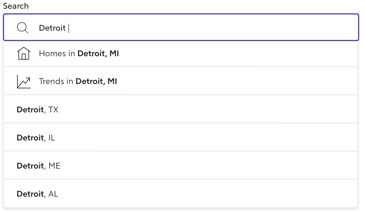
Search Across Categories
If there are different types of results for the same search term that users may need to look, then the categories can be featured at the top of the list for users to choose.
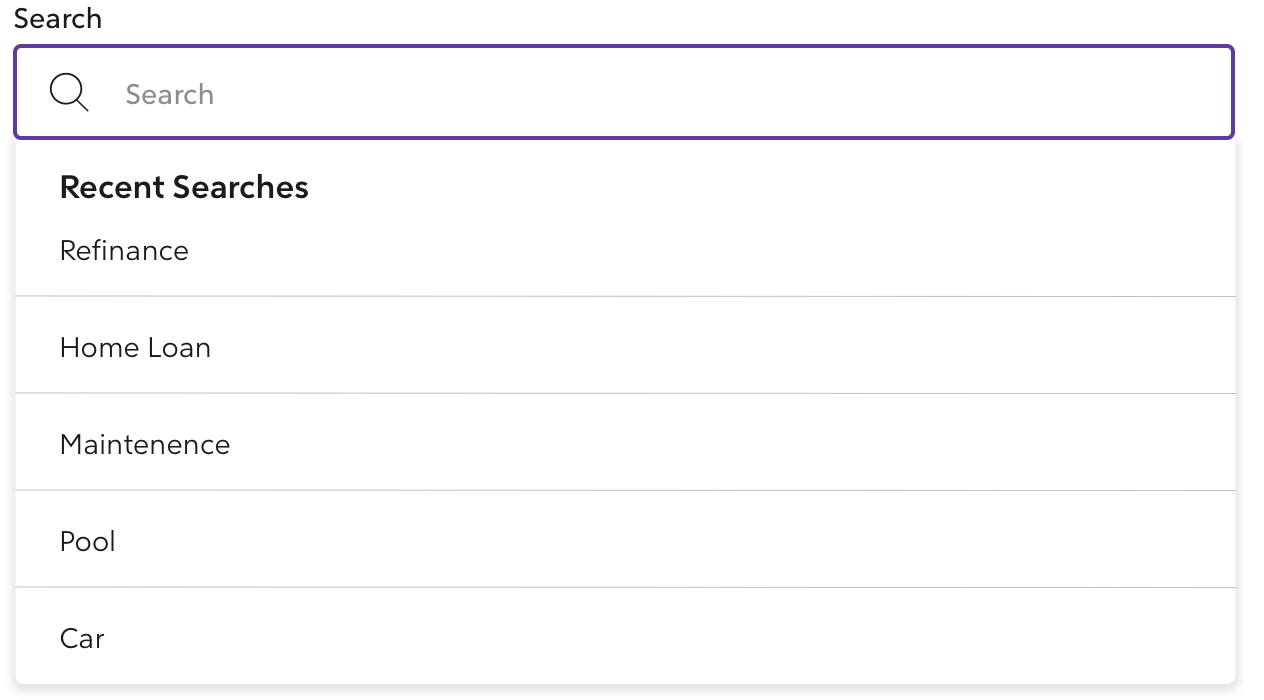
Focused - Without Search
Use a focused state when users have recently interacted with the Autocomplete input. By including terms they have searched in the past, we can help navigate to results quicker.
Anatomy
- May have a search icon.
- Must show predictive suggestions in a listbox.
- Must have suggestions that can be selected.
Accessibility
Keyboard Interactions:
Use the
Up ArrowandDown Arrowkeys to:- Highlight suggested values.
Use the
Enterkey to:- Selected the highlighted suggestion.
- Close the listbox.
Use the
Escapekey to:- Close the listbox.
Use the
Tabkey to:- Select the highlighted suggestion.
- Close the listbox and move focus to the next focused element.
Screen Reader Interaction
- When the input gains focus, it is identified as an Autocomplete.
- When search results are displayed, the number of results is announced.
- When suggestions are highlighted, they are announced.
Helpful Resources
Related Components
To show a full list of options, use a Select Box.
Research
The Autocomplete pattern is based on the principle of recognition over recall.