Color Usage
We've upgraded to the Orbit color palette in August 2020! Review this guide for new color guidelines.
Table of Contents
Our Color Story
The Orbit palette conveys the tapestry of colors seen from a rocket as it ascends into space. Our color choices capture the evolving hue and brilliance of the earth's atmospheres.
We've employed color psychology and user testing to develop this palette. It's built for modern, human-centered, and accessible experiences.
Our color usage guidelines follow WCAG 2.1 (Level AA) contrast standards.
How to Apply Color
When observing the amounts of colors used in a project, it should look similar to the color bar below.
A well balanced color proportion leans towards primarily white backgrounds with black text, followed by intentionally placed interaction and brand colors.
Rocket Red
Use Rocket Red for primary actions, like buttons and key elements. This primary color highlights the main actions on the page.

After placing a primary button, use secondary or tertiary buttons to maintain a clear hierarchy between actions.
Overusing Rocket Red causes distraction from the main action. It's especially distracting when two primary buttons are close to each other.
Orbit Purple
Use Purple to highlight interactive elements, like buttons, links, and active form fields. It can also spotlight important information.
Use Orbit Purple to call attention to interactive elements.
Overusing Purple distracts from interactive elements on the page.
Neutral Colors
Use for text, borders, and system icons.
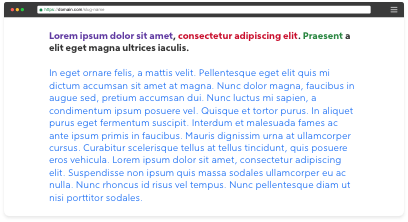
Most text should be black, with some additional shades of dark gray for content hierarchy. Follow contrast accessibility standards when considering anything but black text on white backgrounds.
Most text should be black, with some additional darker shades of gray for content hierarchy.

Don't use any other colors for text like shades of red, purple or semantic colors.
Semantic Colors
Use to communicate the status of messages.
- Green: Success
- Blue: Informational
- Orange: Error, Warning, Urgent or Attention Needed
Do not use semantic colors for large accents.
Use the Error semantic color to present negative information and reserve Rocket Red for positive brand interactions.
Use appropriate semantic colors to indicate the status of messages, like an urgent alert.

Use semantic colors to communicate status. Using them in other places, distracts users from focusing on vital information. Don't use them as accents or action colors.
Floods of Color
Most content should have a white background. To create other sections of focus (for example for a Stepper or Footer), use only these dark and light colors.
Dark
Light
Charts and Graphs
Use these shades of purple to communicate information hierarchy in charts and graphs.
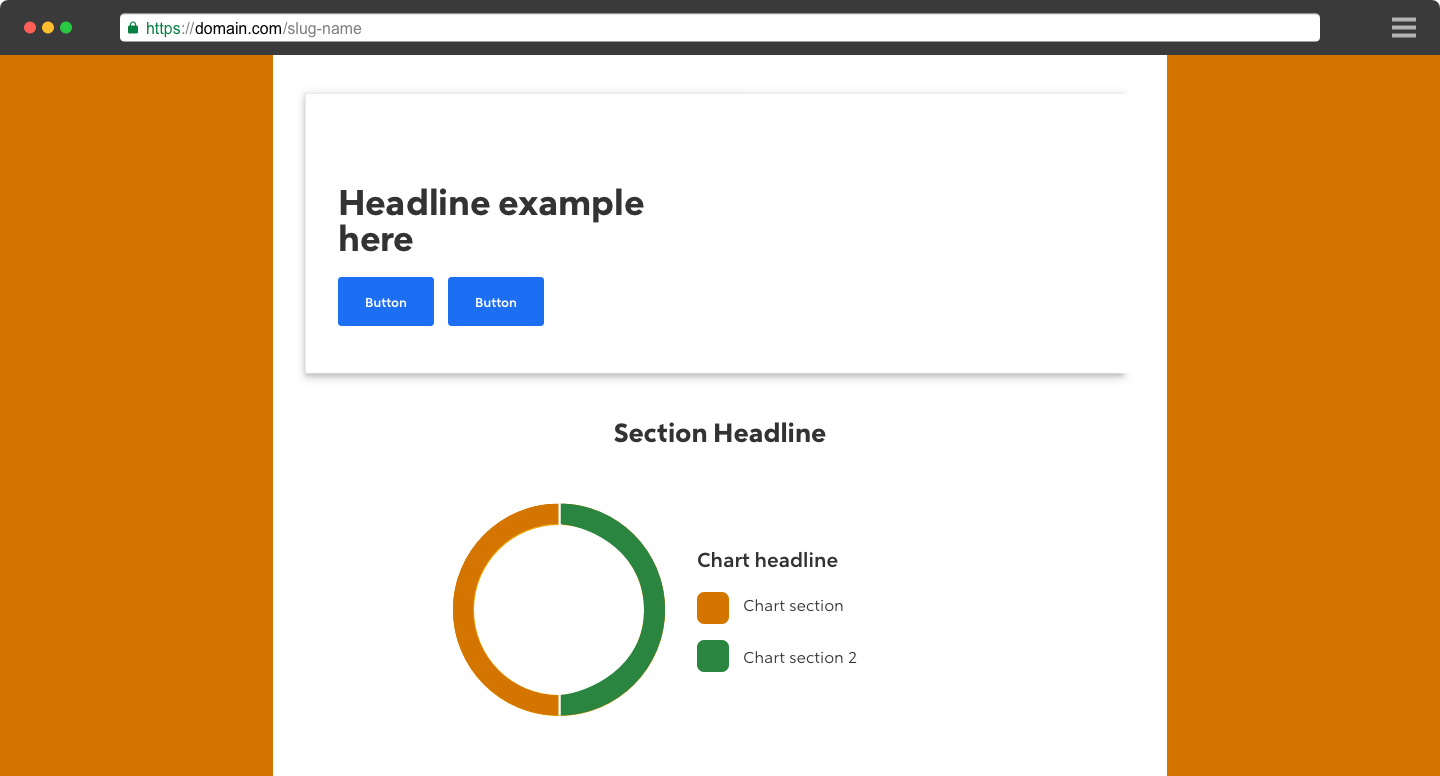
Use the orange semantic error color to represent a negative element in the chart.
Only use other semantic colors as accents to the Purple gradient palette.