Typography
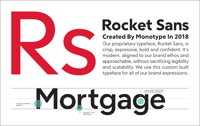
Typography is fundamental to our Rocket experiences. We use a custom developed typeface called Rocket Sans.
Our guidelines optimize content hierarchy by using text sizes, line heights, colors, and font. These factors contribute to what makes content clear and appealing.
Combine these header and body styles to establish content hierarchy within your project.

Table of Contents
Size Reference Charts
Our typography has 7 display styles, 3 body copy styles, and 1 legal type size. The size reference chart is an example of typography when designing. However, when developing a page, reference the Storybook components below.
Desktop
| Scale Category | Weight | Size | Line Height |
|---|---|---|---|
| H1 | Bold | 54px | 60px |
| H2 | Bold | 40px | 48px |
| H3 | Light | 34px | 44px |
| H4 | Bold | 26px | 32px |
| H5 | Bold | 20px | 26px |
| H6 | Light | 20px | 24px |
| H7 | Bold | 16px | 20px |
| B1 | Medium | 16px | 24px |
| B2 | Light | 16px | 24px |
| B3 | Light | 14px | 20px |
| Legal | Light | 13px | 20px |
Mobile
| Scale Category | Weight | Size | Line Height |
|---|---|---|---|
| H1 | Bold | 40px | 44px |
| H2 | Bold | 32px | 36px |
| H3 | Light | 28px | 36px |
| H4 | Bold | 24px | 32px |
| H5 | Bold | 20px | 26px |
| H6 | Light | 20px | 24px |
| H7 | Bold | 16px | 22px |
| B1 | Medium | 16px | 24px |
| B2 | Light | 16px | 24px |
| B3 | Light | 14px | 20px |
| Legal | Light | 13px | 20px |
Headers
Page Title
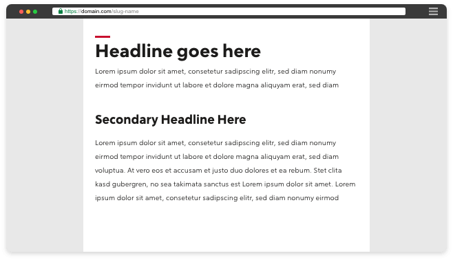
Use one Page Title per page to serve as the main heading. They differentiate themselves from other headings with their red accent line.
Use Page Title with Display One to style primary headings on top-level pages in your experience.
Use Page Title with Display Two to style primary headings on nested pages in your experience.
Developer Documentation
See the code and developer guidelines for this component.

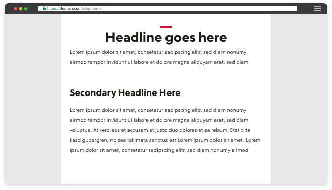
Use page titles at the top left of the page, and left-align the headline with the red line.

Do not center-align page titles.

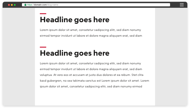
To maintain content hierarchy, do not use multiple page titles on one page.
Display One
Use for primary headings and Page Titles.
Developer Documentation
See the code and developer guidelines for this component.
Display Two
Use for secondary headings and Page Titles.
Developer Documentation
See the code and developer guidelines for this component.
Display Three
Use for third-level headings.
Developer Documentation
See the code and developer guidelines for this component.
Display Four
Use for fourth-level headings.
Developer Documentation
See the code and developer guidelines for this component.
Display Five
Use for fifth-level headings.
Developer Documentation
See the code and developer guidelines for this component.
Display Six
Use for sixth-level headings.
Developer Documentation
See the code and developer guidelines for this component.
Display Seven
Use for seventh-level headings.
Developer Documentation
See the code and developer guidelines for this component.
Body Text
Body One
Use to emphasize text within paragraphs and for sub-labels.
Developer Documentation
See the code and developer guidelines for this component.
Body Two
Use for all paragraph and non-heading text.
Developer Documentation
See the code and developer guidelines for this component.
Body Three
Use for very long sections of text. It has a larger line height which assists with readability.
Developer Documentation
See the code and developer guidelines for this component.
Body Four
Use for legal or de-emphasized text.
Developer Documentation
See the code and developer guidelines for this component.