Button
Buttons allow users to trigger actions and make choices. A Button's text sets clear expectations of what action will occur when users interact with it.
Developer Documentation
See the code and developer guidelines for this component.
Usage
Use Buttons to communicate the different actions users can take and how they can interact with the page.
As a general rule, use one Primary Button as the main call to action to establish the Button hierarchy on a screen.
- Use Button types consistently across products.
- Avoid using too many Buttons on a page.
- Use a Link when the action is to take the user to a new page or to an external site.
Variants
Buttons have different visual weights that help establish a visual hierarchy of the actions a user can take on a page.
- Primary Button (Filled Button)
- Secondary Button (Outlined Button)
- Tertiary Button (Text Button)
- Full Width Button

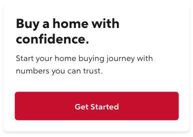
Primary Button
It represents the main action we want users to take on a screen. Filled Buttons have the heaviest visual weight. Use in areas of high importance.
Developer Documentation
See the code and developer guidelines for this component.
Usage
- Use to point out the main call to action on an interface.
- Use one Primary (Filled) Button per screen to help users understand the action hierarchy of the page and to avoid any confusion.
- In a process flow, use to show the main action to help users navigate to the next step.
Example:
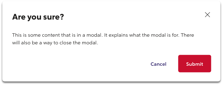
In this example, the "Submit" Button represents the main action in this Button group.
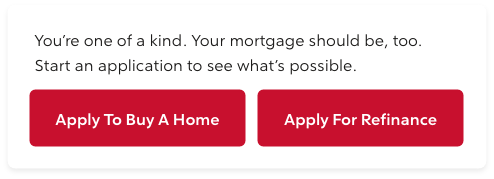
Exception:
- For specific situations where users can choose between two journeys, two Primary (Filled) Buttons may exist side by side.
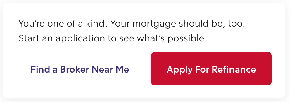
Secondary Button
It represents independent or alternative actions from the main call to action on the screen. Outlined Buttons have a medium visual weight and emphasis.
Developer Documentation
See the code and developer guidelines for this component.
Usage
- There can be more than one on a screen.
- Use for alternative actions that do not navigate the user to the next step in a process.
Tertiary Button
It represents the least important action on a screen. They have a similar visual style to a text Link and have the lowest visual weight.
Developer Documentation
See the code and developer guidelines for this component.
Usage
- For independent or less important actions.
- Use for sub-tasks where a Primary (Filled) Button is the main action.
- In a Button group, use Tertiary Buttons for actions with the least visual emphasis that do not require the user's attention.
Example:

In a this example, the "Back" and "Cancel" Buttons represent the least important actions in the Button group.
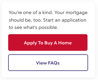
Full Width Button
Use full width Buttons in containers that take up 1/3 of the grid or smaller, like mobile screens.
Developer Documentation
See the code and developer guidelines for this component.
Usage
- A Button that takes up the full width of it's container.
- On mobile screens, Buttons can be stacked.
- When stacked, place the primary action on top of secondary actions.
Example:
States
Disabled
Disabled Primary
Developer Documentation
See the code and developer guidelines for this component.
Disabled Secondary
Developer Documentation
See the code and developer guidelines for this component.
Disabled Tertiary
Developer Documentation
See the code and developer guidelines for this component.
Spinning
Use when data is being saved or submitted. The spinning indicator will replace the Button text.
Spinning Primary
Developer Documentation
See the code and developer guidelines for this component.
Spinning Secondary
Developer Documentation
See the code and developer guidelines for this component.
Spinning Tertiary
Developer Documentation
See the code and developer guidelines for this component.
Button Groups
Buttons can be grouped with other Buttons to establish a relationship between them.
- Group Buttons based on their usage and importance.
- A max of two Buttons should be in a group.
- A Primary Button can be grouped with any less visual weight (Secondary or Tertiary) Buttons.
- Do not mix Primary, Secondary, and Tertiary Buttons in the same Button group.
- Do not use too many Buttons on a page to avoid overwhelming users.
Exception:
- For layouts that require more than three calls to action in a group.
- Use one Primary Button for the main action in combination with two less visual weight Buttons.
- If using a Primary Button in the group, prefer all other Buttons to be Tertiary.
- Do not mix more than two styles of Buttons.
Style Guidelines
Text Labels
- A Button's text should set clear expectations of what will happen when the user interacts with it.
- Always use title case (capitalize the first letter of each word).
- Use task-specific action verbs like: "Add", "Remove", "Read Details" and "Submit."
- Use fewer than 20 characters.
- Use compact words. For example, instead of "Submit Your Information Now" use "Submit."
- Use first-person pronouns. Use "Customize My Loan," instead of "Customize Your Loan."
- Do not use ampersands (&).
- Do not wrap Button text into a second line; it reduces legibility and starts looking less like an interactive element.
Button Styling
- Text should be center aligned.
- Buttons should have 16px of padding on the top and bottom, and 24px on the left and right sides.
- Width should be between 48x and 280px.
- Grouped Buttons should be 16px away from each other.
- Apply the same width to all Buttons in a group.
- Do not use Buttons in paragraphs or within lines of text. Use Link instead.
Button Alignment
As a rule, place the (Primary) Button on the right side of a screen to communicate the main action and captures the user's attention.
This rule follows the Gutenberg Principle, which describes how a user's eye makes a z-pattern when scanning a screen and implies that placing Buttons to the right communicates the main action to the user.
- Buttons should be right aligned to it's parent container.
- Place the main action on the right for the most important action in a Button group.
- Side by Side (Horizontal) Buttons - place the Primary (Filled) Button on the right and all other actions to the left.
- Stack (Vertical) Buttons - place the Primary (Filled) Button on top of the other Buttons to indicate the main action.
Example:
In a Button group with three actions, the ‘Submit’ Button:
- represents the main action.
- is placed on the right of the other Buttons.
- is right aligned to it's parent container.
Example:
In a Button set, the main action is placed on the right.
Example:
In a mobile view, two Buttons are stacked and the main action is on the top.
Anatomy
- A Button must have a text label and/or icon, and a container.
- A Button's text communicates the action that will happen when the user interacts with it.
Accessibility
If a Button only includes an Icon with no text, alternative text must be provided.
Adhere to Web Content Accessibility Guidelines (WCAG 2.1, Level AA) for web usage and to specified Accessibility Guidelines for other digital channels.
We follow, WCAG 2.1 Level AA - Button Aria Practices (Web Content Accessibility Guidelines).