Color Accessibility
To account for the needs of all people, we follow WCAG 2.1 (Level AA) contrast guidelines.
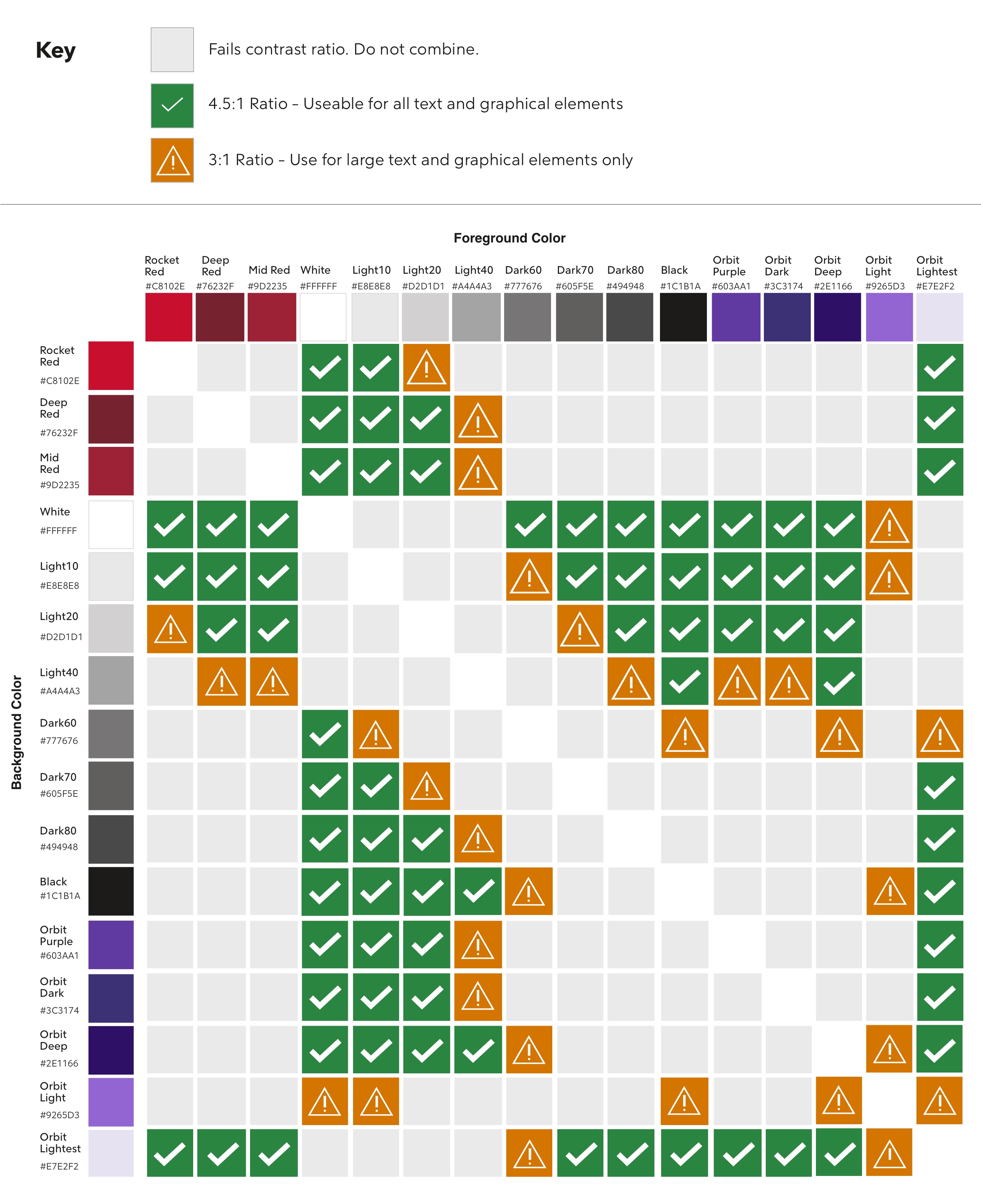
Contrast Charts
Use these charts to discern contrast accessibility between two colors.
The contrast outcomes between two colors can have three possibilities:

Do Not Use - These two colors fail to meet contrast requirements.

Successful Contrast - Indicates a 4.5:1 contrast ratio, and meets requirements for all text and graphical elements.
If text is smaller than 18px (or 14px bold) it must have 4.5:1 contrast ratio.

Needs Consideration - Indicates a 3:1 contrast ratio, and should only be used for large text and graphical elements
At least 18px (or 14px bold) is considered large text.
Each chart image clicks through to view a high resolution version.

Each chart image clicks through to view a high resolution version.
Previous: Color Codes